Winners: Cute Girls And Retro Machines; Loser: Cute Girls?
Yu-Gi-Oh! Go Rush!! Announces It Will Continue For A Third Year.
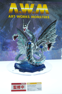
New Yu-Gi-Oh! Figures Announced At Jump Festa 2024
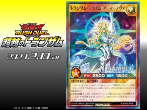
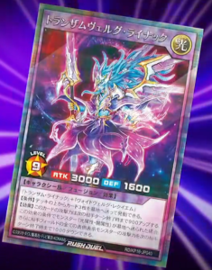
“Transamu Praime Armornova” Released In “Transamu of Transcendence”
Duel Links Announces Celebration For The 7th Anniversary Of Its Global Release
Yu-Gi-Oh! Official Card Game Stories Continues With “Magistus”
Details About Card Game Art Works And The New “Reinforcement of the Army” Artwork Revealed
New “Ancient Gear” Support Announced, Centered On “Ancient Gear Golem”
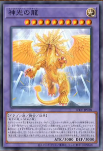
Remake Of “Dragon Master Knight” Announced
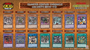
Official Card Game Erratum For “Gandora-X” Announced In “Quarter Century Duelist Box”
Two New Fusions Revealed For “Transamu of Transcendence”
General Info From Yu-Gi-Oh! Official Card Game Times
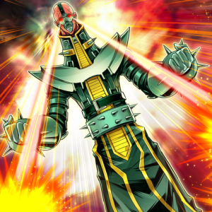
“Jinzo” Support Announced For “Transamu Of Transcendence”
Source: Jump Festa 2024
14 Comments
ngl to you guys, the website’s new format make it hard for me to look at which is the latest news that i havent checked
not to mention the news thumbnail shrank by alot
yeah bro, true, previous format is better than now
Yeah, agreed on this, new layout is very confusing. At first I thought it would be one category per game format which would’ve been nice, but this looks like the same thing as before, just… repeated thrice and with smaller thumbnails. Feels like a mobile layout for a tabloid or something.
Yeah, it’s pretty annoying that there’s a section for Rush Duel news and a section for Master Duel, but not one for, y’know, the actual game.
Yeah! I have the same problem. It’s do hard to navegare and find the newets
Yeah, not being able to go to the next/previous post by clicking the links at the end of a post kind of sucks. I wouldn’t care as much if the front page now didn’t have everything separated into categories so you have to look in 5 different places to read new posts. I just want an easy way to see all posts in a chronological format.
Thank u for the post, but Im pretty sure this was only needed due to the new messy lay out 🙁
We always do these posts for post OCG Times News.
on mobile the new website is awful, i could not find the ancient gear support in the paper-game no matter what. the way you categorize articles needs to change or we’ll just have to resort to reddit or dkayeds site.
The news bloat needs to be sorted out.
you need a TCG/OCG news section similar to how you have created the sections of: RUSH/MASTER DUEL/ARCHETYPE DISCUSSION/RULINGS/MORE CONTENT
Not to be mean but i’ll be mean, the OCG/TCG article category is way more important and needed than the “ARCHETYPE DISCUSSION” category that has those awful piles of cards that pretend to be decks, which could have been moved to the “more content” category that already exists or smthing.
Also the articles about english language OCG cards being released also bloat the news sections, maybe put these in a Miscelaneous section/the more content category. Those articles are borderline clickbait cause you confuse people thinking an archetype is getting new support and its just old cards getting printed in english.
this NEEDS to be a category : https://ygorganization.com/category/news/ocg-tcg/
just like how https://ygorganization.com/category/master-duel/ is a category
Different take: Yes the mobile site feels a little bugged, however;
There already is an OCG/TCG category of news; it’s the first of the four that are listed in the sidebar and I’m pretty sure it was that way as soon as the site layout was updated, considering the article tags didn’t appear to change. If anything, the issue lies with the fact that not all of the TCG/OCG news is tagged as such.
Quincymccoy’s deck lists are very much appreciated.
Since almost every card reveal article has the set number in the title, the articles about the Asian English cards are generally clearly labeled.
Now all of that said, I agree that the site would probably benefit from returning to the standard layout, where all of the articles are just listed chronologically regardless of their category, and then maybe you can also have them organized by category below it.
i checked again and it really feels like they just forgot to add an ocg/tcg news section above the master duel news section in the homepage. (the top is just the most recent articles of ALL categories together. if through some way there is 6 articles in a row that are not about the ocg/tcg, then there is no way to find ocg/tcg articles without having to browse the website.) It’s just missing by accident.
In the news button of the header there is a dropdown of OCG/TCG / Rush and there the Master Duel button is missing similarly
Thanks for the summary! l’m fine with the new site, but could you keep all the headlines together instead of putting half of the newest news on top of the page and the rest on the bottom with the Master Duel/ Rush Duel/ etc. sections in the middle? Thanks in advance!
I’m going to be honest, I missed a couple of these articles because of the awful new layout.