

The first look at the new Overframes in the Limit Over Collection Packs!
Konami have teased the first glimpse at Overframes, with two new forms of Dark Magician and Blue-Eyes White Dragon. Their effects will be revealed during tonight’s OCG Times stream, starting at 2:15 PM JST.
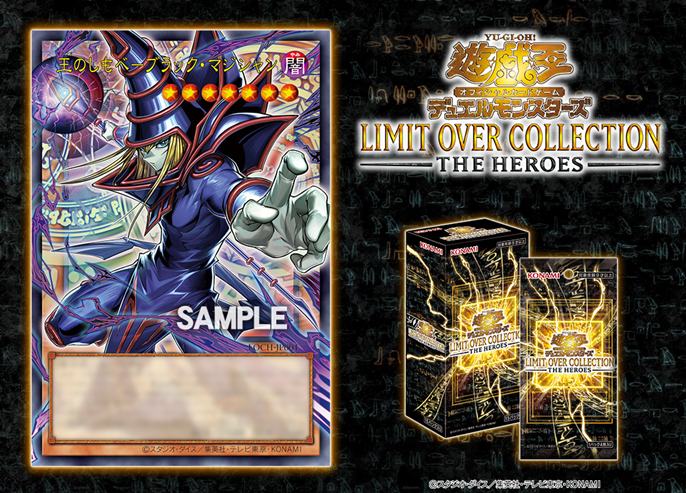
LOCH-JP001 – Pharaoh no Shimobe – Black Magician / Dark Magician, the Pharaoh’s Servant
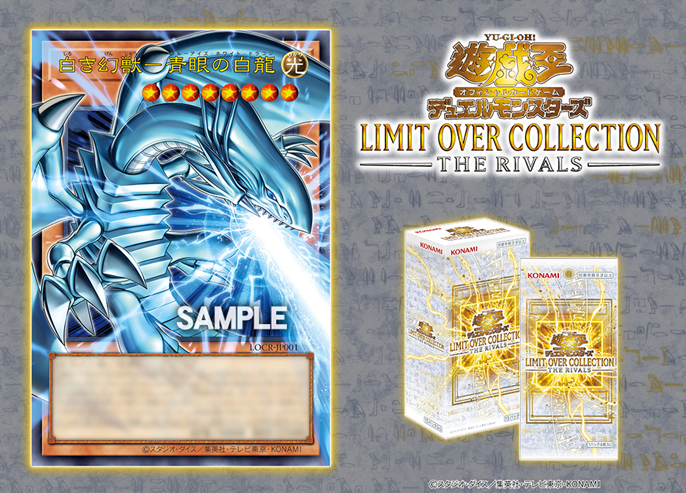
LOCR-JP001 – Shiroki Genjuu – Blue-Eyes White Dragon / Blue-Eyes White Dragon, the White Phantom Beast
45 Comments
The limit is over, gentlemen. And the only question left is ‘whu does DM have no fingernails?’
gloves
He looks like wearing white gloves
He looks like wearing white gloves
He looks like wearing white gloves
He looks like wearing white gloves
He likes to tickle unattended bald people
me when gloves exist:
Skin-colored gloves? That’s cursed.
White gloves? So he’s gone from the pale green to being whiter than the actual White Dragon?
What are hands, if not flesh gloves?
the white phantom beast? does that mean blue-eyes is a phantom beast?
It could be based on the Pharaoh memories arc, just like Dark Magician here. Based on the perception the Egyptians had of Blue-Eyes at that time.
i think the name here is based on the lore from Atem era
He’s wearing gloves that match his skin?
They look awful. I’d have preferred to not have them.
There trying so hard to be like Pokémon and MTG. Too little, too late lol.
Just random users trying to be different.
Phantom Beast huh
Yeah, curious and legally supported by Cross-Wing, Rock Lizard and Thunder Pegasus.
SO EXCITED FOR THIS!!!
These look so bad next to the Rush ones lmao
They are literally the same so if you think these look bad then you must think the rush ones look bad ZZZ especially since they essentially beta tested these in rush
crazy, and effect monsters? for blue-eyes and DM, bro I’m so happy about these
The long long wait is over gentlemen, holy Exodia these look amazing
I want EXODIA pieces remade like this
I’m sorry but these look disgusting. Maybe if we’d gotten them 20 years ago like Pokemon did it would’ve been easier to get used to them, but these just look like fan made Orica cards to me.
Skill issue
They dont look bad, but i feel it could have been done a bit better
After some thinking, the full art MIGHT NOT look good on Pendulum and Link cards…
It will depend of art work of the link monster because some of the early link monster had link arrows as part of their bodys, link kuriboh is one of them is tail as a link arrow on the point, they just need to aline them with the card
Nice Orica Cards.
Next year is Zexal’s 15th anniversary. Please Galaxy/Photon structure deck 🙏.
Yugioh community go 1 day without crying about nothing challenge (impossible)
Still better then the Stars Wars and Fallout community.
It’s fine but I wish they had consolidated the level stars into a number like rush duel. I don’t like how they clutter the art.
THESE are NOT going to save the dying TCG. Also, are we not going to get anime cards in this set? So much for the so-called “Animation Chronicles successor”.
These cards will most likely reference the Millennium Arc of DM (when the monster were real), because their arts are taken from there.
This instead of revealing new Tier 1 Dark Magician support to honor Kazuki feels and seems a bit criminal. It’s always disappointment reveals. DM just need 4-5 new main deck cards to be competitive. Konami acts like this is hard to do. DM support is a money maker machine. Or maybe I’m just really desperate atm.
DM will never be competitive lil bro, complain elsewhere
BEWD is my favorite airplane
So I take it the other rivals will have their own retrains
Looks sick. Crazy it took this long though,
isn’t the naming scheme for Blue-Eyes more in line with the “of White” series of cards?
as in, wouldn’t it be “Phantom Beast of White”, I forgot to add
Overframe Monster cards need to portray the Level as Rush Duel does, 1 star with a single number inside, also within its own small border separate from the art. This takes up minimal space, and doesn’t overlap with the artwork. As you can see here, the yellow and orange stars look hideous when superimposed on just about any artwork. These cards haven’t released yet, so I’m hoping one of Konami fixes this